BTR: An Adorable Hayes Valley Studio
Hooray, another Behind the Redesign! Thank you for being so patient, dear readers. We had a BTR hiatus this past season due to a series of confidential projects. We are excited to kick-off 2015 with some new content and, of course, tips for you to use at home.
Room: Bedroom/Living Room
Hours to Complete: 8.5 (Day 1)
Main Objective: Transform the layout of the room to establish distinct and optimized areas for sleep, entertaining, and creating art.
The Details: Our lovely client, “M”, landed in this charming Hayes Valley studio by way of karma-heritance (that's our way of saying this positive karma-related inheritance). Wanting to adopt a simpler lifestyle, M decided to downsize from her large loft in SOMA. Coincidentally at the same time, one of M's co-workers was relocating to New York, leaving his perfectly-sized apartment. With this transaction, M inherited several pieces of furniture, but she also inherited a less-than-optimized furniture layout. A small space with too much stuff and an awkward furniture layout? New Minimalism to the rescue!
Over 2 day-long sessions (18 hours total), we worked swiftly to create a serene and comfortable home, one that reflected M’s dynamic personality: creative, open, approachable and intellectual. Session 1 focused on the bedroom/living room, and Session 2 tackled the large walk-in closet, as well as a utility closet. Today's Behind the Redesign will focus on Session 1, the bedroom/living room.
Windows: Before // After
We knew right away that we wanted to move the bed away from the windows. Resting your head against a solid surface is important for deep sleep. When you sleep with your head against a window it is almost like sleeping against a door, the reptilian (think Neanderthal) part of your brain subconsciously stays alert to outside noises so that you will be prepared to defend yourself. So, first order of business was swapping the bed and the couch.
“Tip: Is the head of your bed against a window or a non-functioning door? Look around your room and reevaluate the position of your furniture. Is your desk, which actually only functions as a drop-all space, taking up the best wall in your room? Or perhaps you can condense your clothing into a capsule wardrobe so that it fits entirely in your closet and you can donate your dresser? Whatever you decide, make sure that your bedroom functions firstly as that, a BEDroom. And give that bed the best wall in the room. To get extra fancy, Feng Sui recommends that you are able to view the entrance of your room while lying in bed.”
The existing couch was extra-long, so when we moved the couch into bay window, we placed it on a slant in order to decrease the amount of dead space between the window and the back of the couch. This, we surmised would be a temporary solution, recommending that our client replace the couch with one that would better fit into the window alcove.
However as we worked within the space, we realized there were a lot of benefits to placing the couch on a slant. By angling the couch towards the bedroom, we drew the couch-sitter’s attention away from the entry hall and the kitchen, creating a conversation area with the base of the bed and the new-and-improved music corner. Other benefits of the current couch: the extra-long couch worked great for our extra tall client, structurally, it was super solid and in great shape, and we all agreed that the draped fabric lent positively to a casual, comfortable vibe.
“Tip: Add texture and warmth to a minimally-decorated space using fabric, blankets and pillows. Here, a drapey fabric covering contrasts well with the bare hardwood floors. If you are working with a textured rug, balance it with clean lines with the furniture.”
Accent Wall: Before // After
With this redesign we were lucky that M already had these perfectly proportioned and matching side tables, adding some nice symmetry to the general eclectic vibe. We also scored with the charcoal accent wall. This wall helps to define the sleeping area, signifying that it is separate from the rest of the space. With the two table lamps, the contrasting shapes add interest, while unified color keeps it, well, unified.
As an artist who gets fully-absorbed into projects and then moves on to the next, M did not want to adorn her walls with art. Over the bed we chose to hang a series of simple line drawings to stand out against the charcoal, neutral enough that M would not tire of looking at it.
Music Nook: Before // After
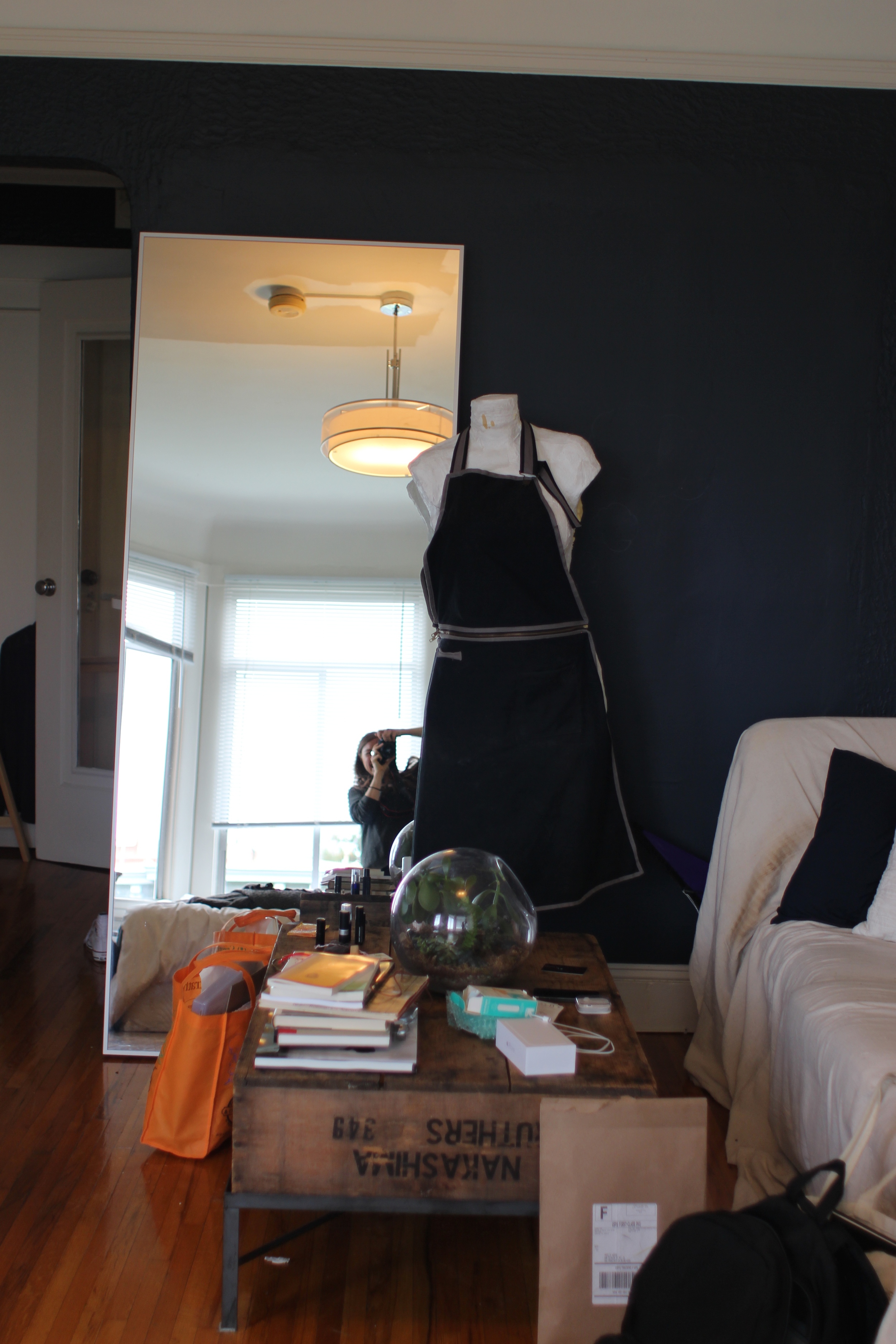
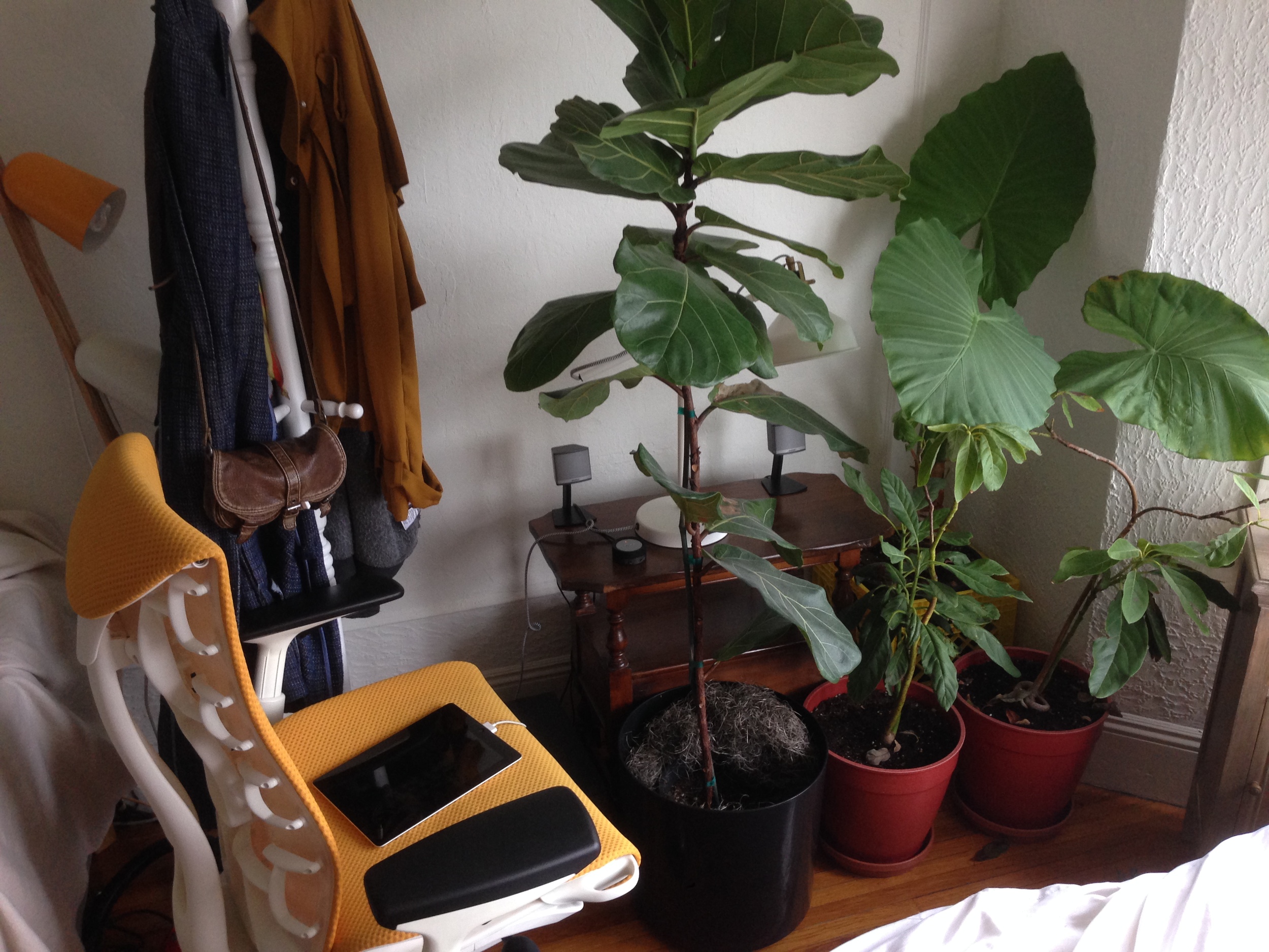
Music is an important part of M’s routine. Whenever she is home she is sure to have some pleasant tunes playing the background (M even introduced us to FIP, our new favorite radio station out of Paris). So with this design, we wanted to ensure that she had easy access to her speakers. We also wanted to make order out of a mess of cables.
Enter, amazing large leaning mirror that was karma-herited. If you don’t already know, we are quite fond of large mirrors. When positioned strategically, they reflect light and can feel like another window. Added benefit: when placed on the floor to lean, they can hide those unsightly cords and cables. So that is exactly what we did here. And I think it is worth noting that opposite there was a wall that was perfectly sized to fit the mirror, but if placed there, the mirror would reflect the white wall - booooring. By placing the mirror on the wall opposite the light and bright kitchen, you extend the eye and draw some of the brightness into the bedroom.
“Tip: When using a large mirror in your space, make sure to consider what is in the reflection. Are you opening the space by reflecting other bright, airy spaces? Play around with placement. As the sun light changes throughout the day, maybe you will discover something new about your space that you would like to highlight. Not into the idea of always seeing your own reflection? Look for a distressed mirror with a patina over the glass so obscure the reflection.”
Overall we were quite thrilled with the results of this decluttering and redesign. We donated two carloads of items to the Goodwill and local library, in the meantime creating a calm, inspiring sanctuary for M to enjoy.
Up next on BTR: The fancy closet system we custom designed and installed to house M’s clothing and art archives.


