BTR: A Family Kitchen
Kyle writing to share with you another Behind the Redesign. In Behind the Redesigns we like to divulge all our little design secrets in the hopes that you'll be able to incorporate some of these tips into your own spaces. You may have noticed that there have been fewer BTRs posted in the past several months. That is because we have been saving many client projects for the New Minimalism book! But we were able the dig into the archives for today's Behind the Redesign, which details the kitchen session of two super cute soon-to-be-parents. We'll call them Melissa and Adam.
When we first toured Melissa and Adam's kitchen, we saw that although the surfaces were not overwhelmed with stuff, behind closed doors the cabinets were filled to capacity and the storage was not functional for their day-to-day needs. With their first baby on the way, we also needed to create space for infant-related gear.
Here is a rough sketch of the kitchen floorplan to give you a sense of layout.
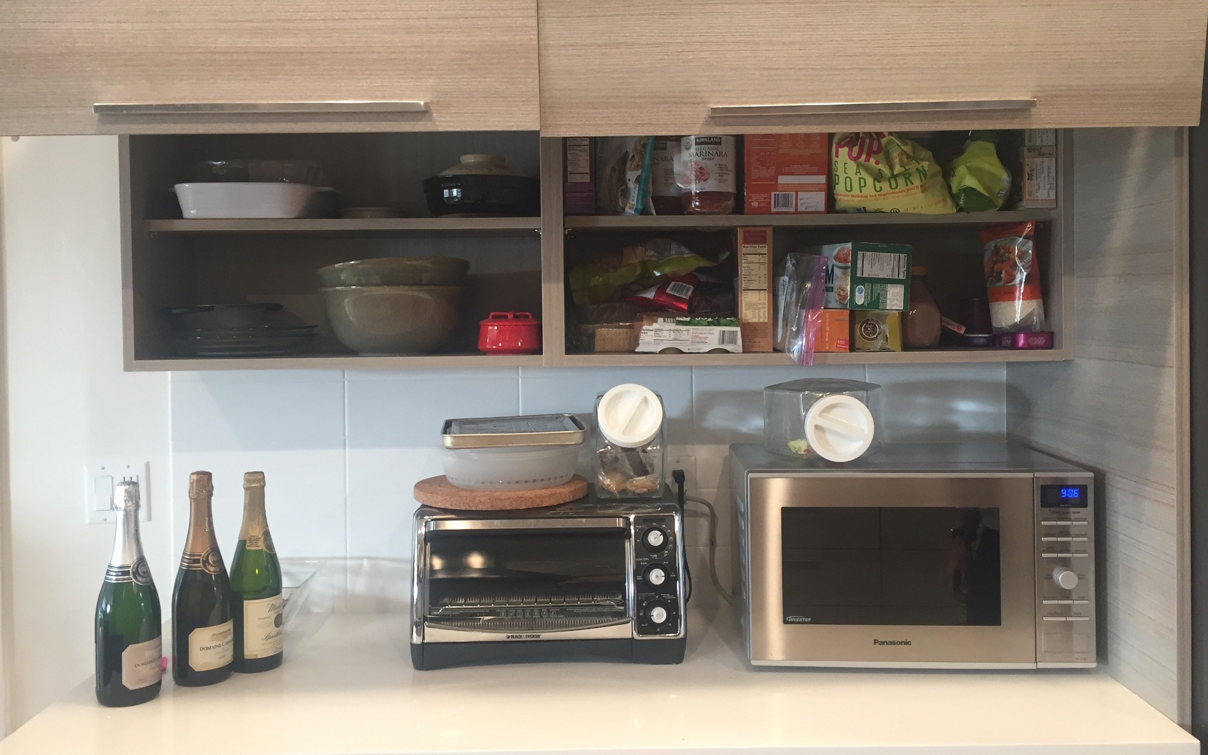
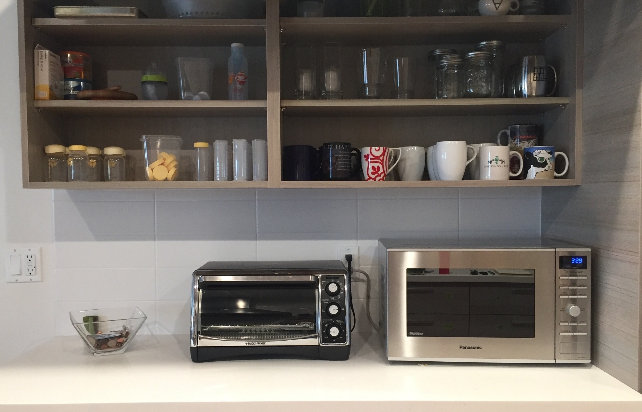
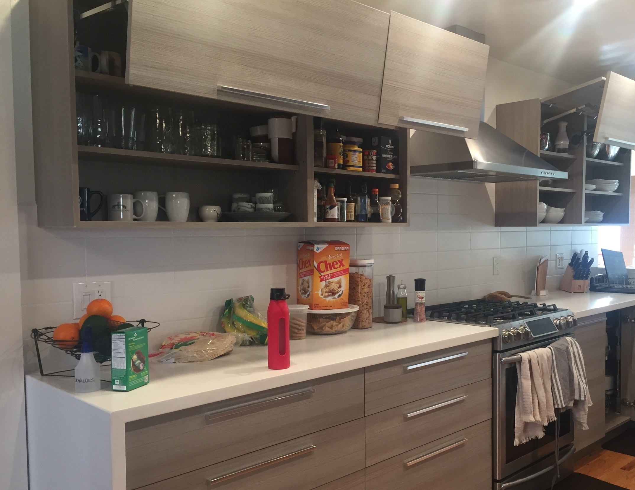
Above left is the before image of the cabinets above the microwave. As you can see in the floorplan, these cabinets are right in the middle of everything, and should be used for highly-accessed items. Instead, they were storing serving dishes that were used once a month, and acting as a too-small food pantry.
In the after photo, above right, we designated one cabinet for all things baby. We know from working with young families (and our nieces and nephews), that baby gear is abundant with small pieces of glass and plastic that require frequent washing. We wanted to ensure plenty of space for the baby items to spread out and have room to dry. We relocated the serving dishes to a cabinet near the sink. We designated the previous food pantry for mugs and glassware. The food we moved to a cabinet that was larger and better suited for food access since it was above the large countertop where food prep takes place.
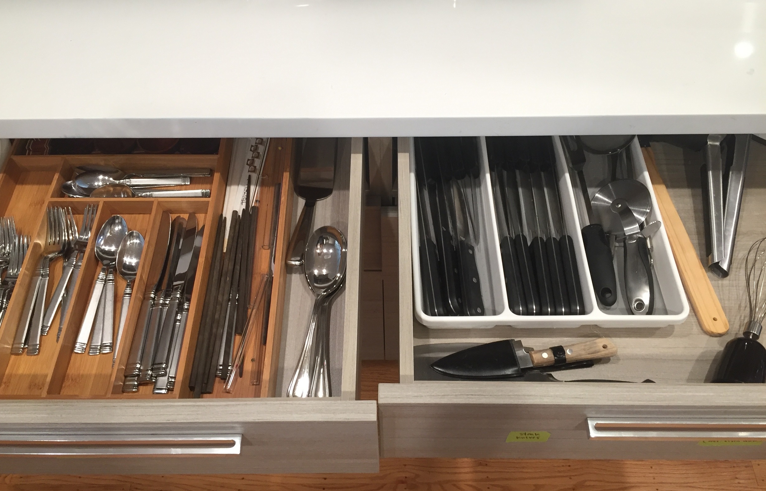
The above images are the drawers beneath the microwave. Again, these drawers are a prime location, but were being used for non-daily items. The uppermost drawers in the kitchen are the creme de la creme of kitchen real estate. What happened here, and what typically happens when one moves into a new space, is that our clients just guessed which drawers should be used for what. Like the junk drawer and first aid drawers in the before photo (left), a few items in these categories needed a home and this was the simplest, in-the-moment solution. But then, like bunnies, soon the items multiplied to take over the entire drawer. As we teased apart the storage needs of the kitchen, and saw that there was available storage in other areas of the home, we allocated this drawer space to the essentials of the kitchen - utensils and cooking tools.
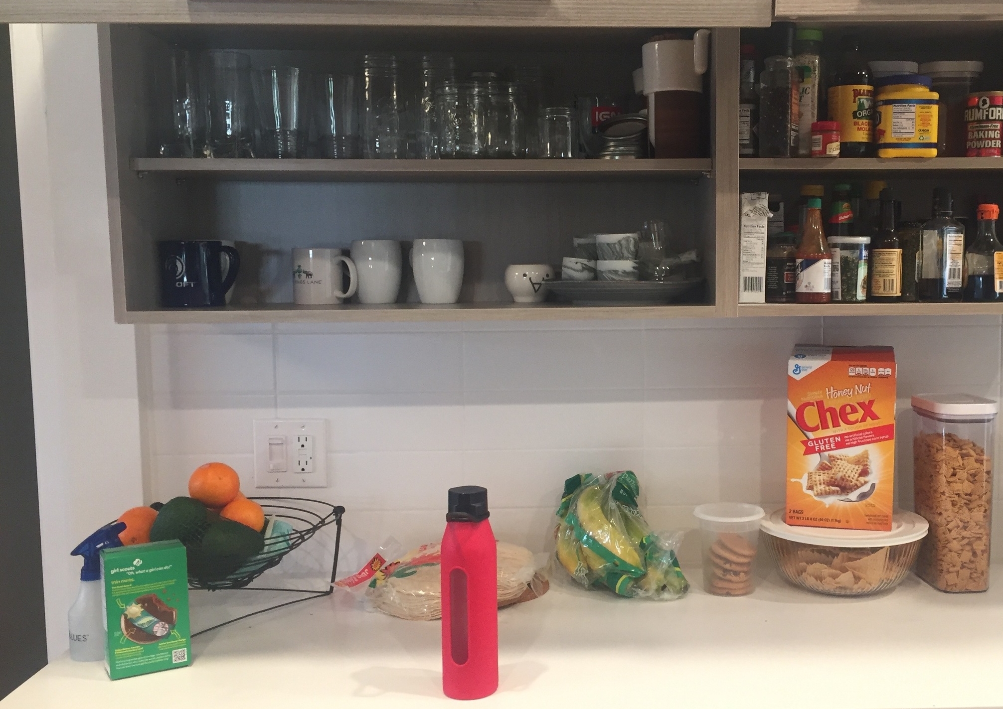
Again, the biggest difference in the photos above is the relocation of items. You can see how the glassware had too much space in the before photo (left), and meanwhile the pantry was cramped in a cabinet across the kitchen. We swapped the two, and advised Melissa and Adam to make meals using their existing pantry supplies in order to reduce the overall volume (you can see in the after photo, right, that items are stacked, which is not ideal for accessibility).
Above, creating more cabinet space for pantry items means that countertops can remain clear except for a limited number of quick-grab items. Clutter attracts clutter. So keeping countertops clear means that they are more likely to stay clear. Plus cleared countertops are far easier to wipe down.


