BTR: Creating a Home Retreat for a Traveling Professional
Room: Wardrobe (all clothing) and Bedroom
Hours to Complete: 10.5
Main Objective: To open up floor space and lighten the feeling of the cramped room by removing duplicative furniture and clothing the client no longer inspired creativity or joy.
The Details: Client K approached us to redesign her bedroom. As with all bedrooms, we start with clothing. Its a crucial first step because it illustrates how much actual storage a room needs, rather than what might appear necessary while the wardrobe is bloated with outdated and underused clothing.
Thankfully, K already had plenty of practice creating what we call an Essential Wardrobe. For work, K often travels to Europe for weeks at a time. In living out of a carry-on suitcase, she was forced to distill to her most practical, versatile, and loved pieces. Yet while she was able to travel with a select capsule, K's wardrobe at home still had an abundance of clothing that she was not longer using or inspired by.
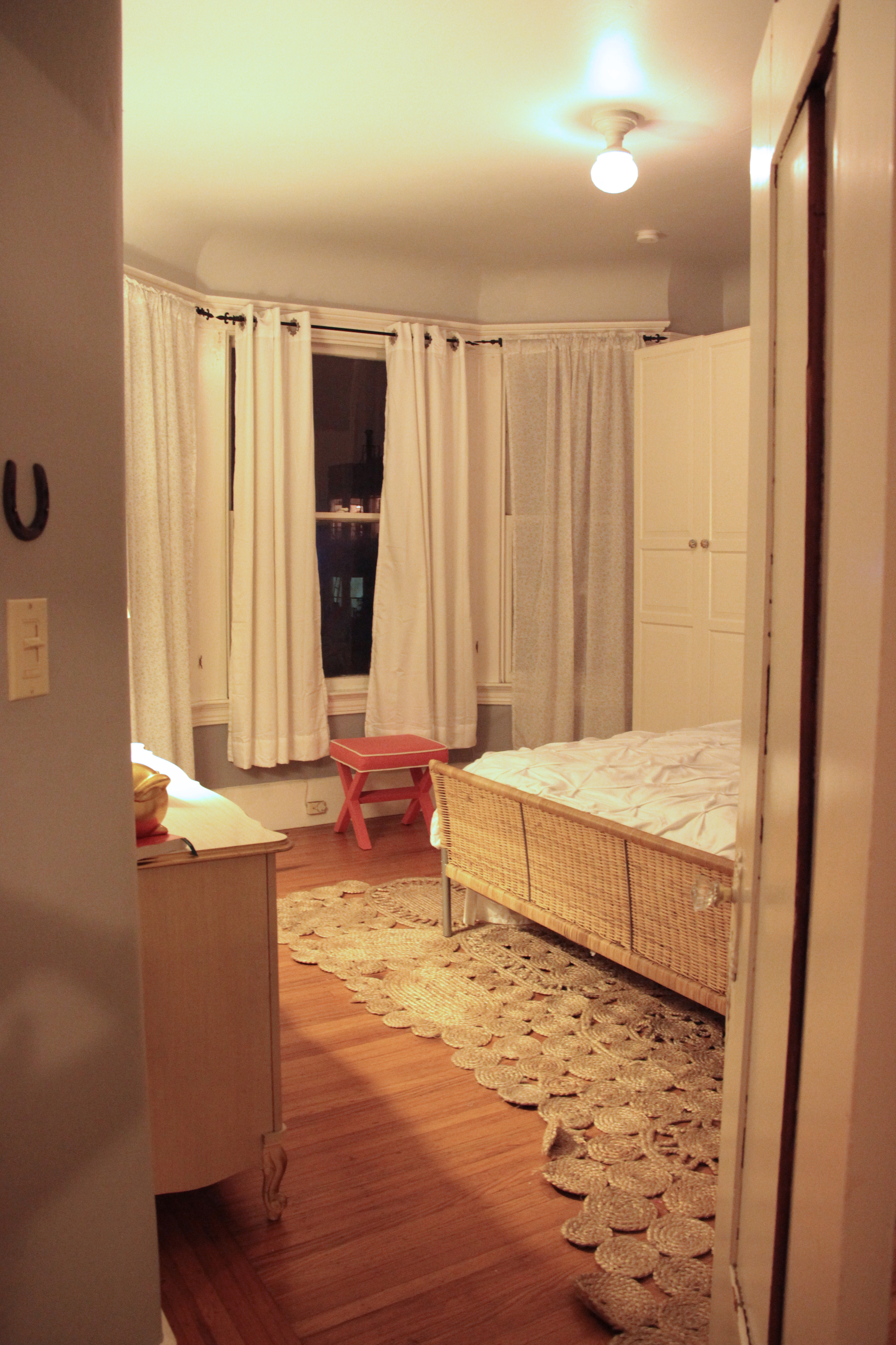
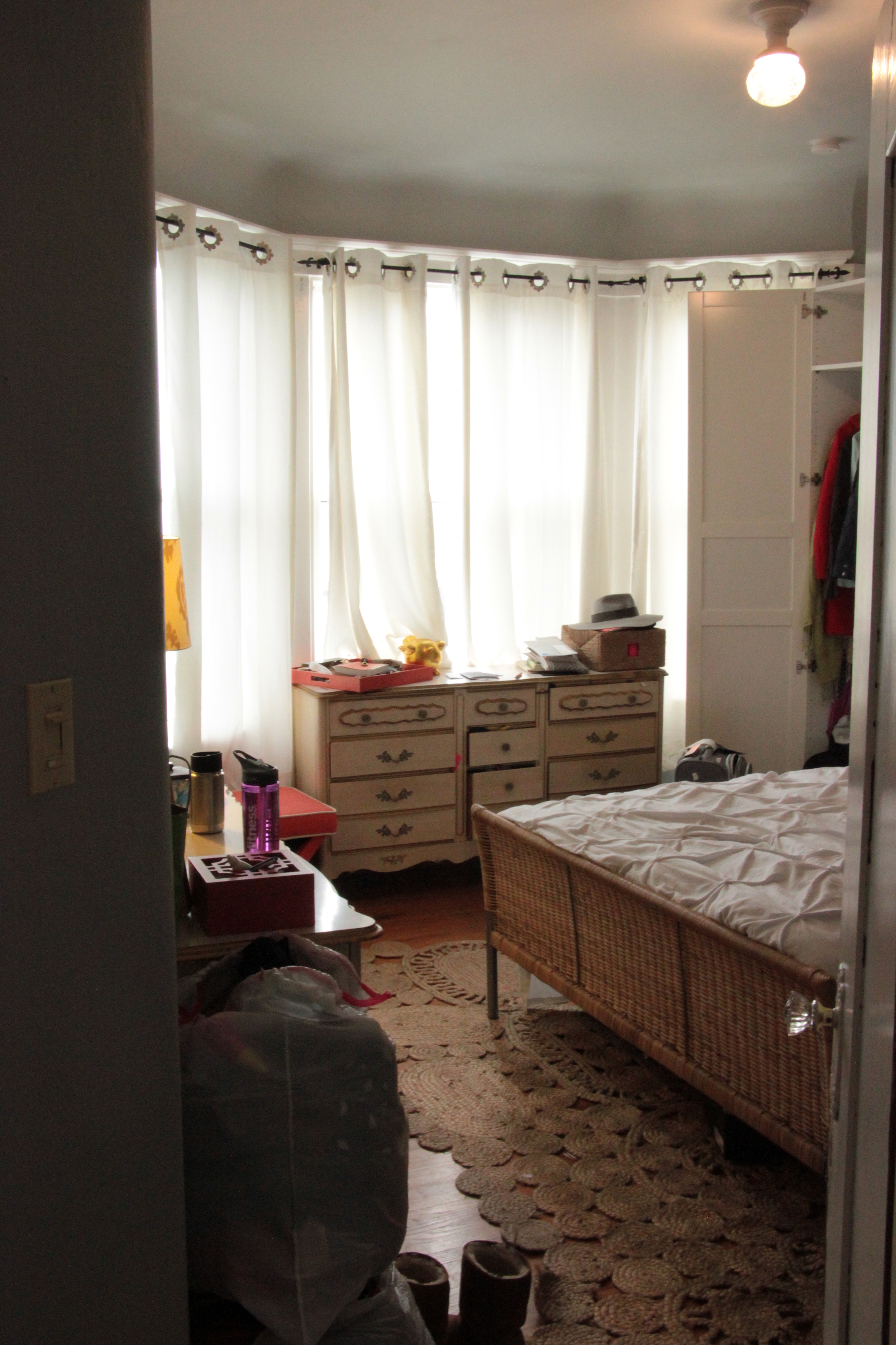
In the before image, you can see that there are two large dressers in the room. There is one on the left of the frame, and one near the windows. We determined that it would be best for flow and the limited floor space to reduce the clothing so that we could remove one of these dressers. Not all pieces of clothing can be hung or folded, and we knew that by removing one of these pieces, we would need to create drawer space elsewhere. In the after photo, you can see how much bigger the room feels with one less piece of furniture. Now K can easily access her windows and city views!
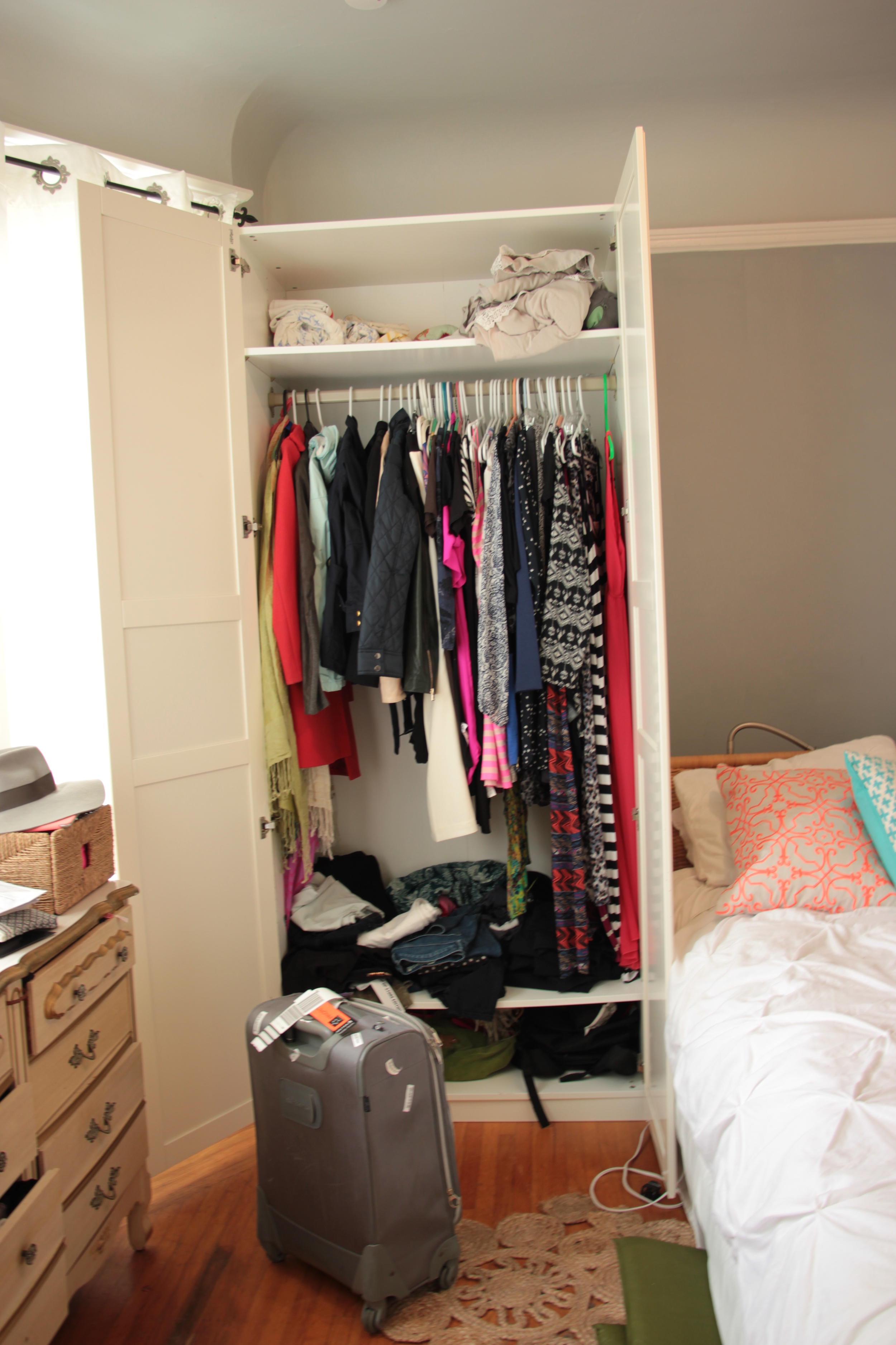
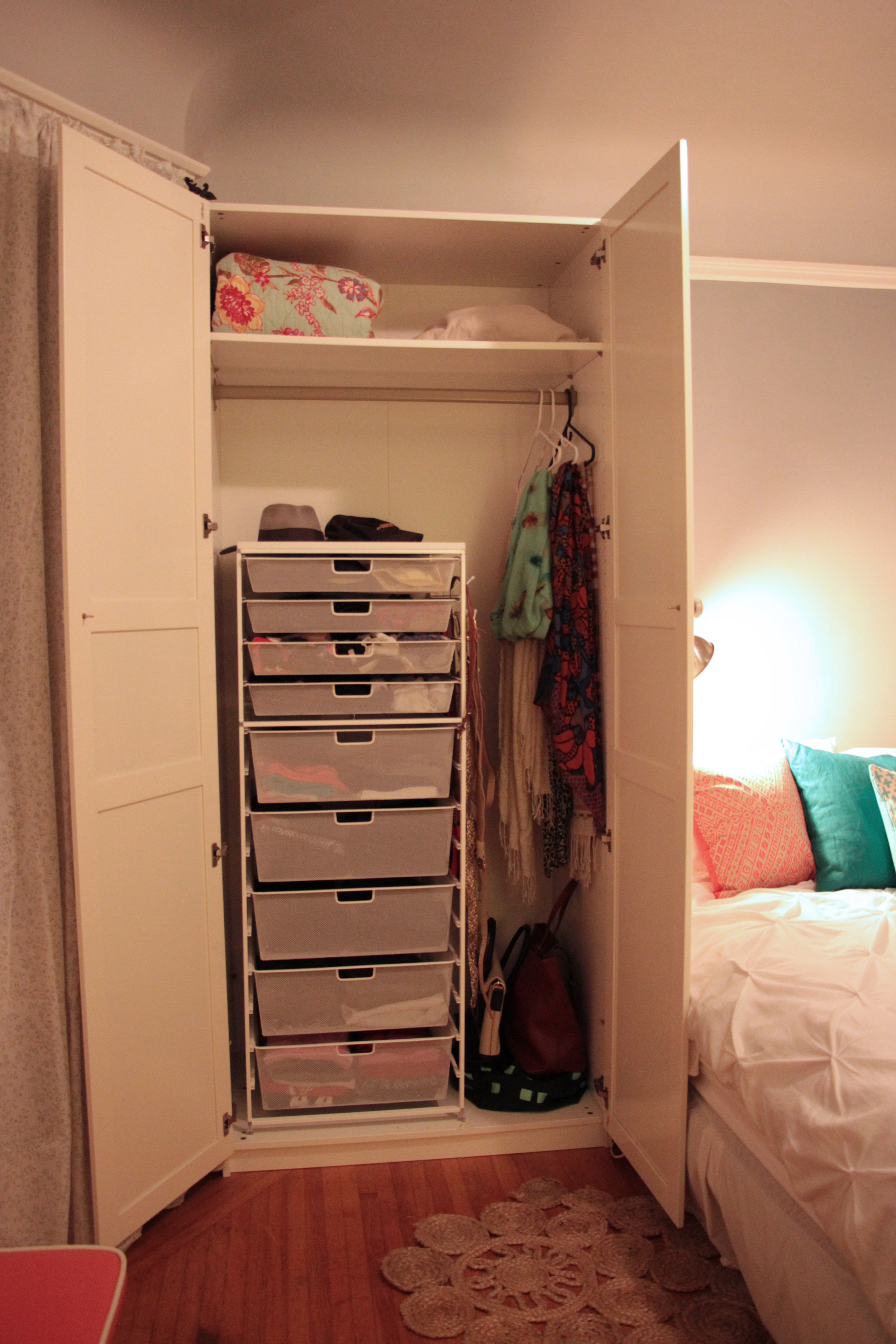
Above is a photo of one of the two armoires in the bedroom. We decided to make up for the lost drawer space by adding a free standing set of Elfa drawers here. Now workout clothing and undergarments have clear homes, extra linens are stored above, bags and scarves to the side.
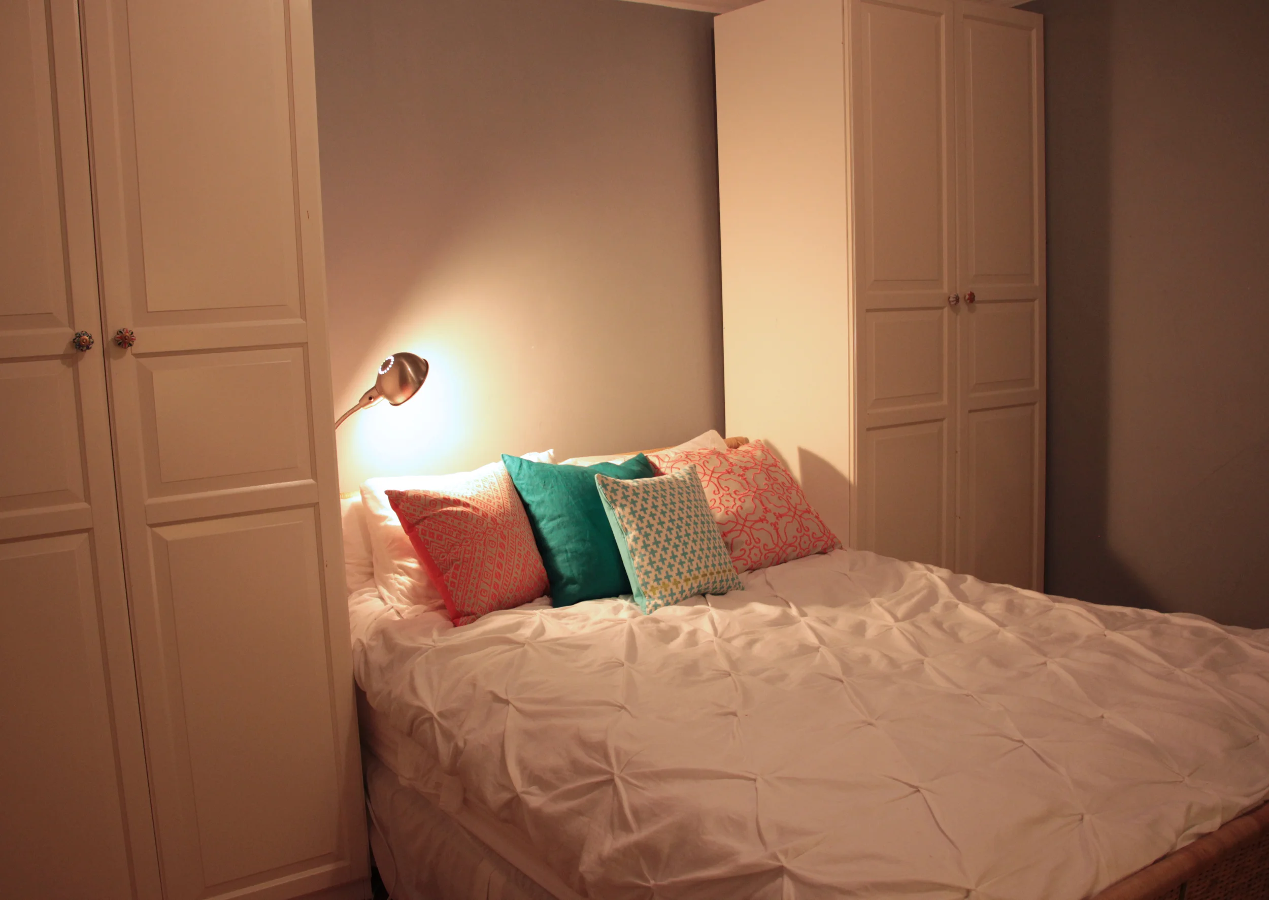
K placed two armoires flanking the head of her bed. We all agreed the armoires added nice definition to the space and K liked the cozy sleeping nook they created. However there were a few design and feng shui elements we needed to remedy.
If you look closely in the before image, you can see that the bed was not pushed against the wall but instead had several suitcases and a full but unusable bedside table behind the headboard. This ate into the already-tight floor space and not being against a wall creates a slight sense of unease while lying in bed. We decluttered all the items under and behind the bed, finding new homes in the hall closet and in the newly decluttered dresser for the small group of keeps.
For a finishing touch, we added custom cabinet pulls to the drawers. This small detail had a huge impact of tying the armoires into the rest of the décor.
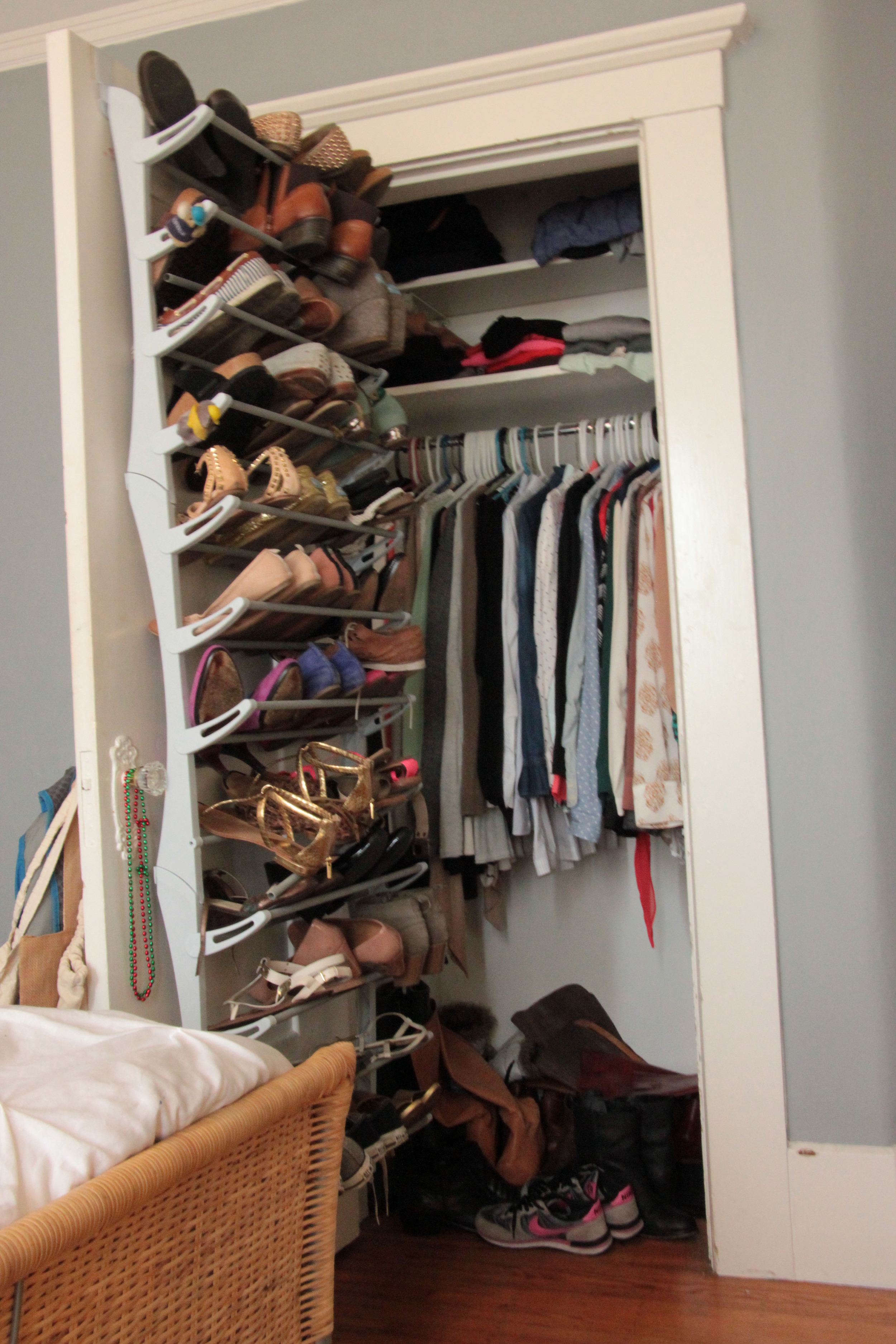
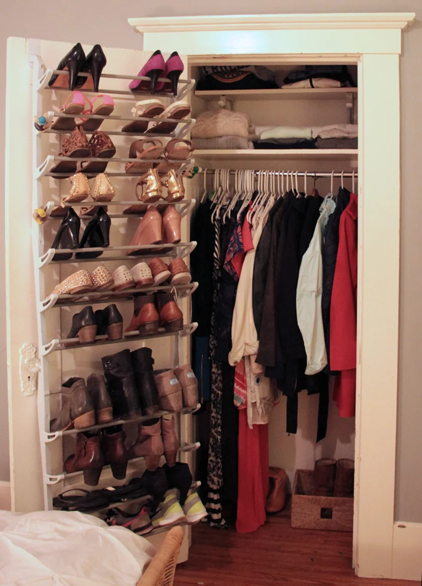
By thoughtfully editing her gorgeous shoe collection, we were able to easily fit all of K's shoes on her rack or neatly tucked in the base of the closet (rather than in a large pile like before). The biggest difference to notice here is that all of K’s winter coats and long dresses now live here in a neat and orderly fashion. By relocating her long hanging items to this closet, we freed space in one of the armoires to make space for a new shelving unit. Plus, having her jackets close to entrance of the space makes for an easier transition out the door.
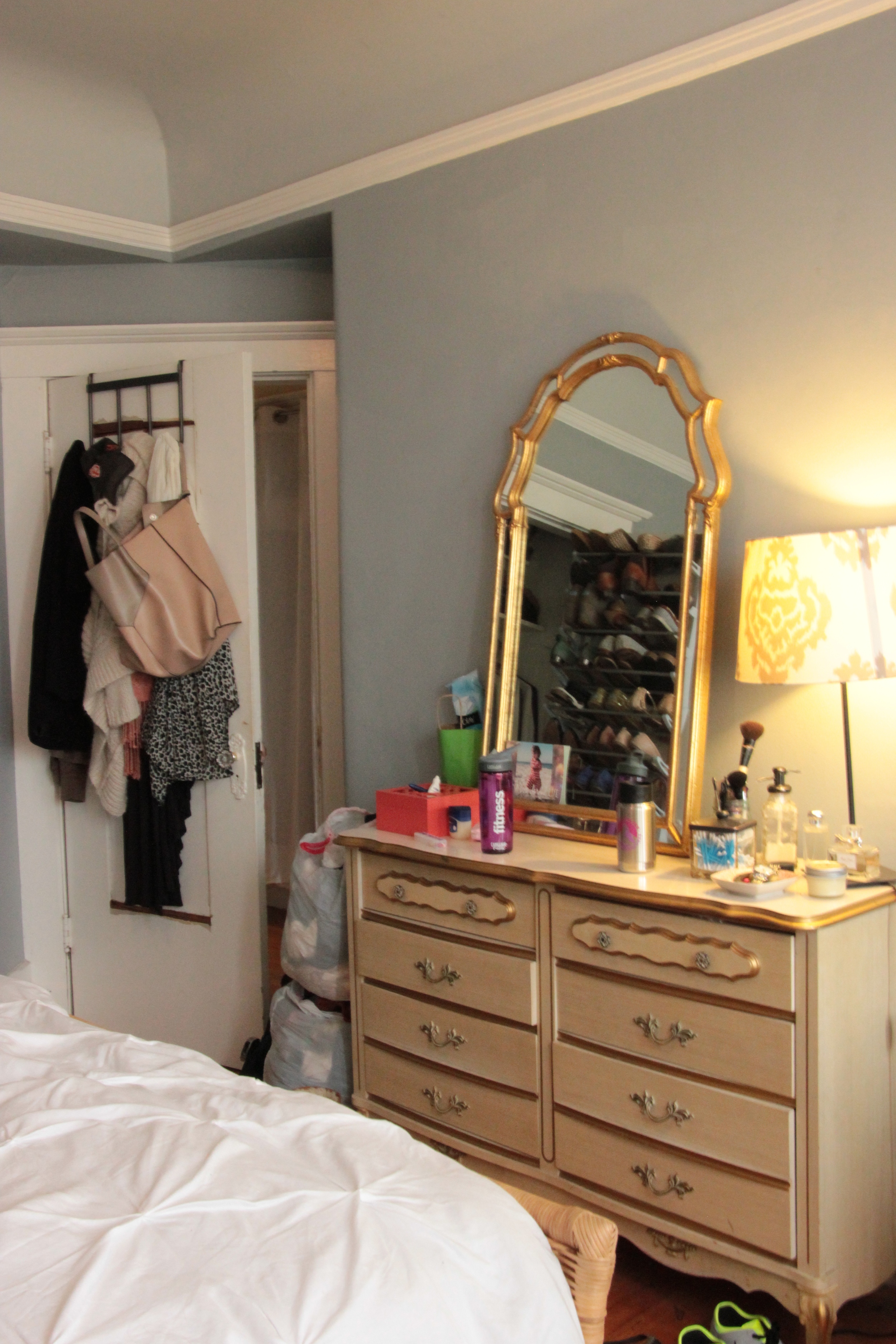
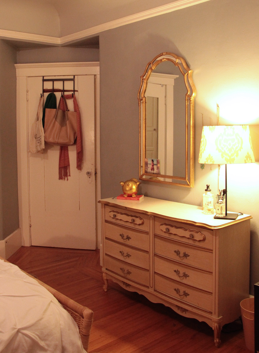
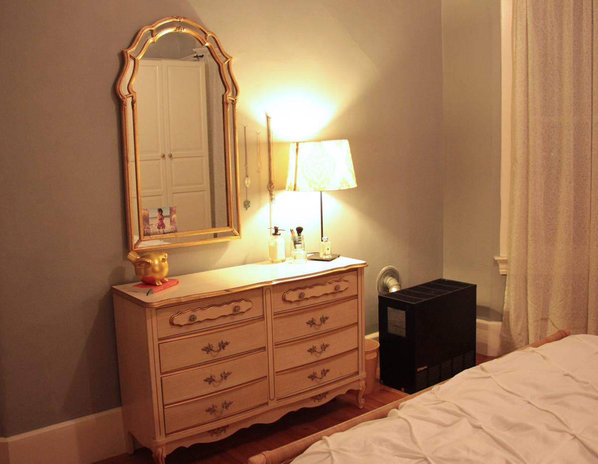
This shot looks towards the entrance of the bedroom. You can see the second dresser before was cluttered with daily-used items, and the back of the door was full of jackets and scarves. We completely emptied this dresser and removed a the majority of makeup (which was expired or out-of-date) and donated a bag of costume jewelry and accessories. Afterwards, this piece of furniture neatly housed all makeup, non-bathroom toiletries,and office-related materials. With the mirror now, the countertop is clear and able to serve as a proper vanity.
A final look at the beautiful space!

